Welcome to the world of eCommerce! How you showcase your art is so important, and that doesn’t stop at galleries. Ensuring your art is visually pleasing and accessible through your website and social media is key to selling! This is your “shop front” so it needs to be clear and engaging.
This article will give you an overview of what you need to do to create your online store and start selling. To start, let’s get to know the different elements that make up your store. All of the elements (except parts of the checkout page) can be customised to suit your Store’s needs and style.
Product Gallery
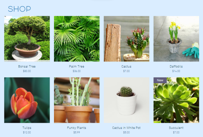
A Product Gallery is where you display your products. You can choose between different layouts and grids to showcase products and collections in the best way for your store.
A Product Gallery is where you display your products. You can choose between different layouts and grids to showcase products and collections in the best way for your store.
Product Widget
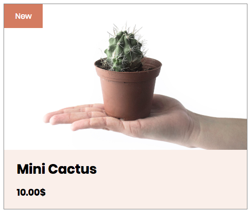
A Product Widget is an element you can add to your store to display a specific product. Use this if you want to highlight an item on sale or for a new arrival.
A Product Widget is an element you can add to your store to display a specific product. Use this if you want to highlight an item on sale or for a new arrival.
Product Page
The Product Page is where your visitors can see more info about a product, e.g., sizes, colors, or a more detailed description. They can get here by clicking on a product from the Product Gallery. From here, customers can add a product to their cart.
The Product Page is where your visitors can see more info about a product, e.g., sizes, colors, or a more detailed description. They can get here by clicking on a product from the Product Gallery. From here, customers can add a product to their cart.
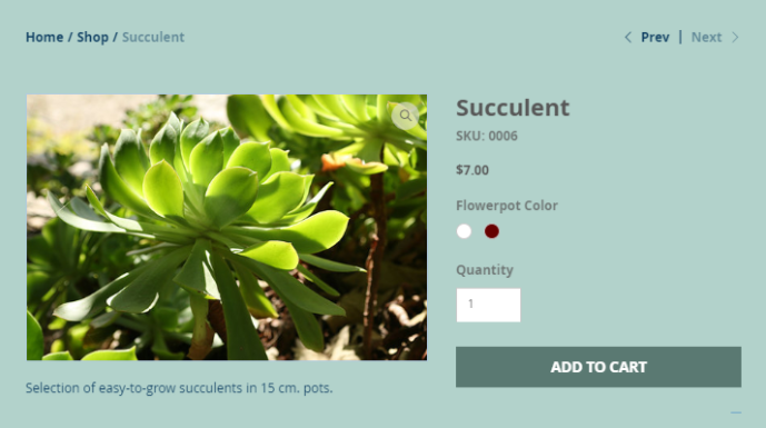
This is a dynamic page, which means you only have to customize it once. The design stays the same but it displays whatever product was clicked on.
Shopping Cart Icon
The shopping cart icon shows your customers what they are interested in buying. It appears in your header so customers can see it no matter where they are on your site. When they click on the cart icon, it will lead them to the Cart Page.
The shopping cart icon shows your customers what they are interested in buying. It appears in your header so customers can see it no matter where they are on your site. When they click on the cart icon, it will lead them to the Cart Page.
Mini Cart
The Mini Cart lets customers see what’s in their cart while they’re still shopping. When a customer adds an item to the cart, the Mini Cart slides in the side of the page displaying a summary of its contents, e.g., price, quantity, and subtotal.
Shopping Cart Page
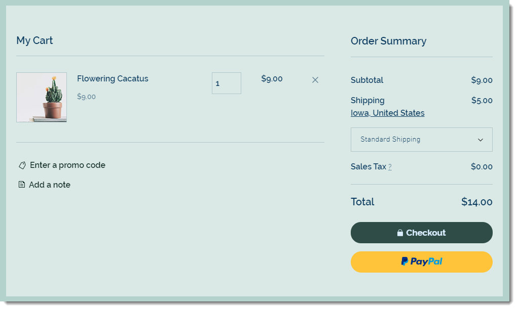
Shoppers arrive at the Cart Page by clicking View Cart in the Mini Cart or by clicking on the Shopping Cart Icon (if you set it up to go straight to the Cart Page). From the Shopping Cart Page, customers can review their order, see a preview of shipping and tax costs or proceed to Checkout. To preview this page, go to your live site, add a product to your cart, and then go to your cart.
Shoppers arrive at the Cart Page by clicking View Cart in the Mini Cart or by clicking on the Shopping Cart Icon (if you set it up to go straight to the Cart Page). From the Shopping Cart Page, customers can review their order, see a preview of shipping and tax costs or proceed to Checkout. To preview this page, go to your live site, add a product to your cart, and then go to your cart.
Checkout Page
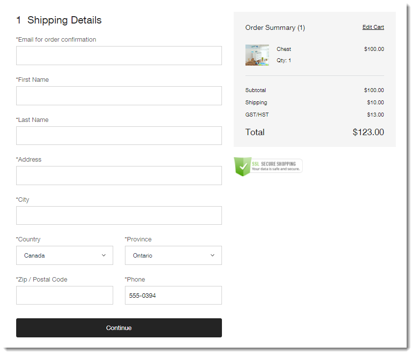
The Checkout Page is where customers complete their purchase. They are asked to provide details like shipping details, billing info, and policy agreement.
The Checkout Page is where customers complete their purchase. They are asked to provide details like shipping details, billing info, and policy agreement.
Thank You Page
As soon as customers complete the Checkout, they are taken to the Thank You Page. It provides a review of their order and leaves them with a positive note. The words “Buyer Name” are replaced by the name of the customer.
As soon as customers complete the Checkout, they are taken to the Thank You Page. It provides a review of their order and leaves them with a positive note. The words “Buyer Name” are replaced by the name of the customer.
Tip:
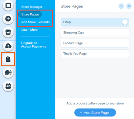
You can access store pages and elements by clicking on the store button on the right side of the Editor, and then selecting Store Pages or Add Store Elements.
Now, let’s start building!
Firstly, make your way to the page you’d like your store to be (or create it if you haven’t done so already).
- On the above picture you can see the grey icons to the left, click on the + icon and select “store”
- After selecting which layout you would like for your art, a template will show on your site. Now click on the template and choose “settings”, “manage” then “manage store”. This is where you can add and update all your artwork.
- Go back on to the “dashboard” after you have saved your products – you will see to the menu on the left.
- Here you can ensure all your steps are taken including your payment and so on.
Always double check your store works from A-Z before going live and if you have any issues Wix has a great help center with support and advice.
All stores can be customised and you can go back and edit so take your time!
Credit to Wix: https://support.wix.com/en/article/adding-store-pages-in-wix-stores

